The goal in developing this travel app was to make it possible to plan various trips. The app should be aesthetically pleasing and should not have any unnecessary functions.
– A work with Maria Ettelt –
Paper Prototyping
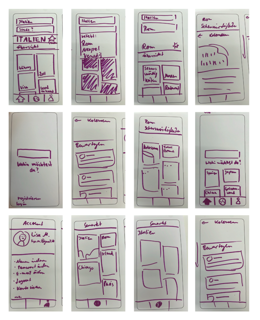
We started the project with a simple paper prototype. Our idea was to create the trips nested into subcategories (country, city, sights).
We carried out the first tests with the app POP. The nested design turned out to be too complicated and was discarded.
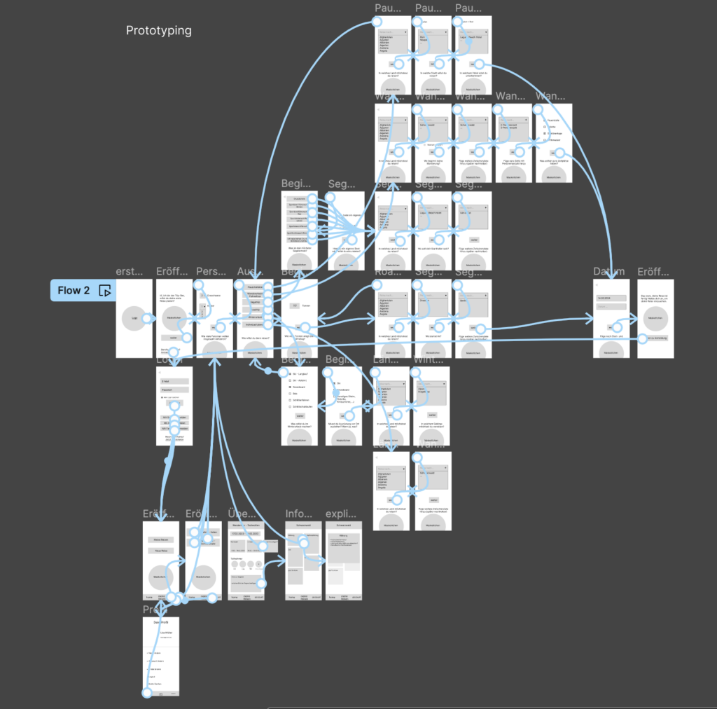
App Flow
For the further edit, we worked with Figma.
We figured out the personas and use cases. An important aspect of the content is that the trips can be put together independently and individually.
At the beginning, the user has the choice between these kind of trips:
- package tour
- hiking vacation/bike tour
- sailing trip
- road trip
- winter vacation
- individual planning
After selecting the appropriate category, the user is guided through a series of queries through the possible trips. The trip can be saved and edited later if necessary. Additionally, users can also be added to specific trips.
Mascot and Color Palette
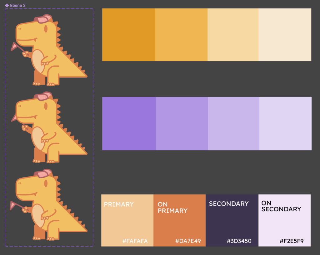
To emphasize the simple design of the app, we chose pastel shades of orange (primary color) and purple (secondary color). The mascot become a T-Rex, who guides the user through the app – The Trip-Rex.
Digital Prototype: Low-fidelity
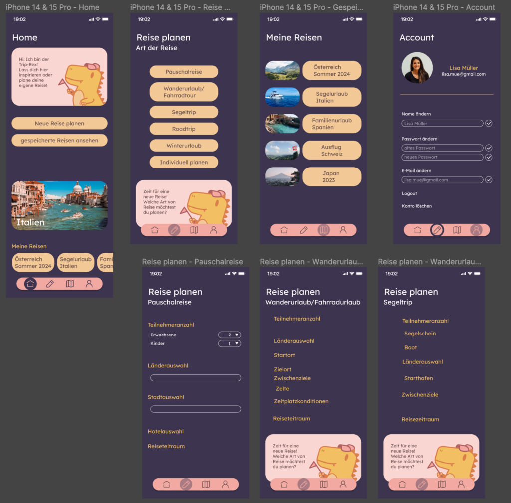
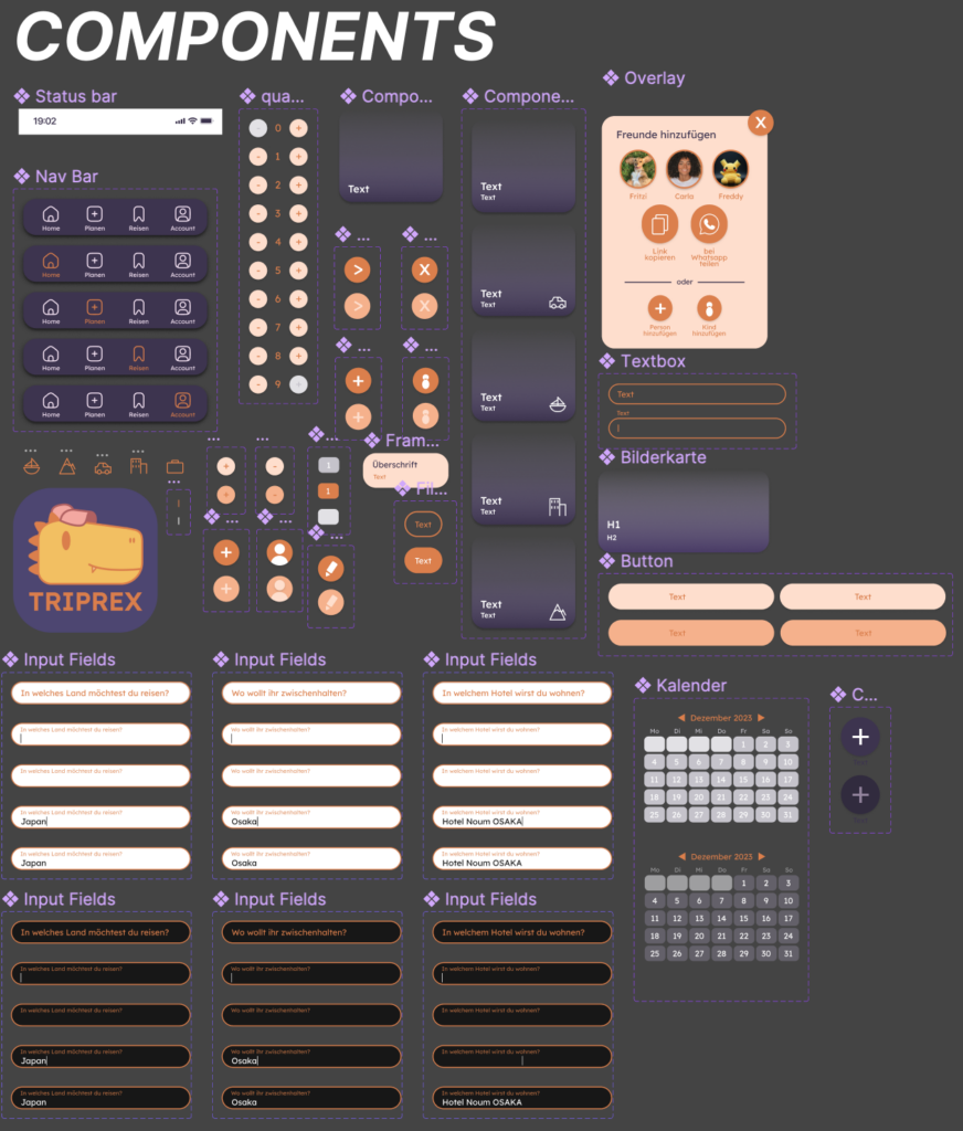
In order to ensure accessibility right from the start, we tried to design the app in dark background colors. Unfortunately, the result did not meet our expectations: The app seemed too overloaded and too colorful. We therefore chose brighter colors and added an accessible mode later (see below). Furthermore, a consistent structure had to be developed for the elements (buttons, navigation bar, …).
Getting more structure
The next step was to structure the app. The elements were designed with the primary and secondary colors. Variants of the elements for the different states were created and color-coded.
Digital Prototype: High-fidelity
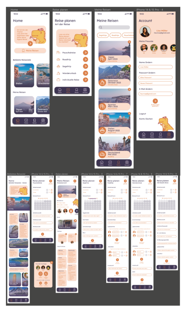
For simplicity, the finished prototype got a white background. The different kinds of travel also received individual icons. Now, it is also possible to add people to a planned trip who do not use the app themselves (e.g. children). The “winter vacation” option has been removed because it differs only slightly from the package trip and can be planned using the “individual planning” option anyway. In order to keep the app as clear as possible, we have limited the number of screens: All app functions are presented in just 11 screens.
Accessibility
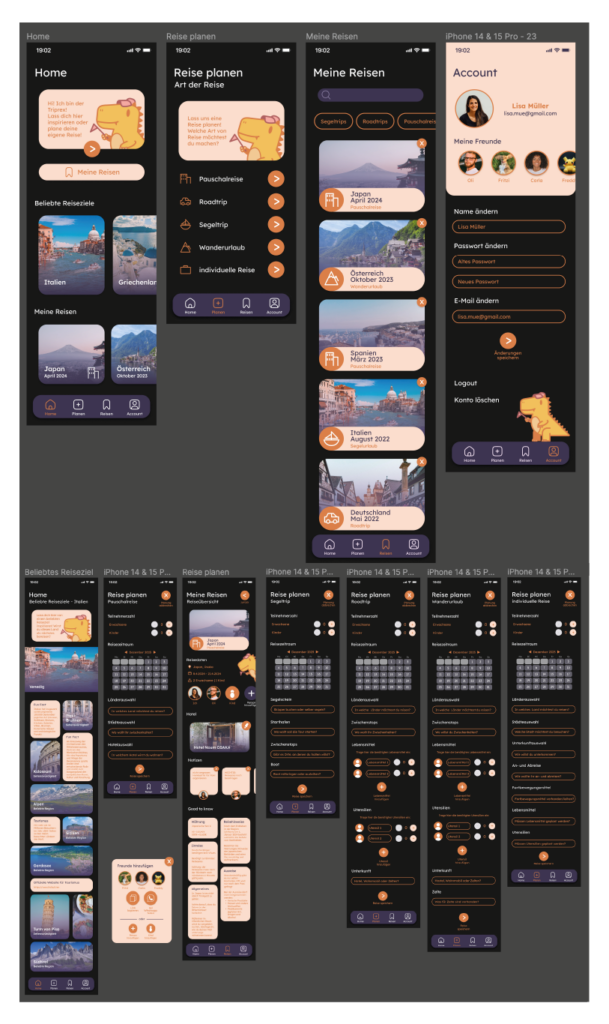
To ensure barrier-free access, we added a dark mode. In contrast to our original design, we now used a dark grey instead of the dark purple.
Final Prototype
Take a look at the videos about the opening of the app and a casual flow. You can also test the prototype on your own by scanning the QR Code. (The App is currently only available in German, but we are working on an English version!)
